PHRESH CANNABIS
PHRESH CANNABIS
Elevating the brand of one of Canada’s top-selling cannabis beverages: Phresh.
TYPE
Brand Development, Packaging, Social, Print
TIMEFRAME
6 months
TEAM
Nicole Lee, Eric Block, Dani Reynolds, Nathan Legiehn
Made at Scratchpad Studio
ROLES
Visual & Brand Strategy, Packaging Design, Production Design, Photography Planning, Art Direction
The Ask
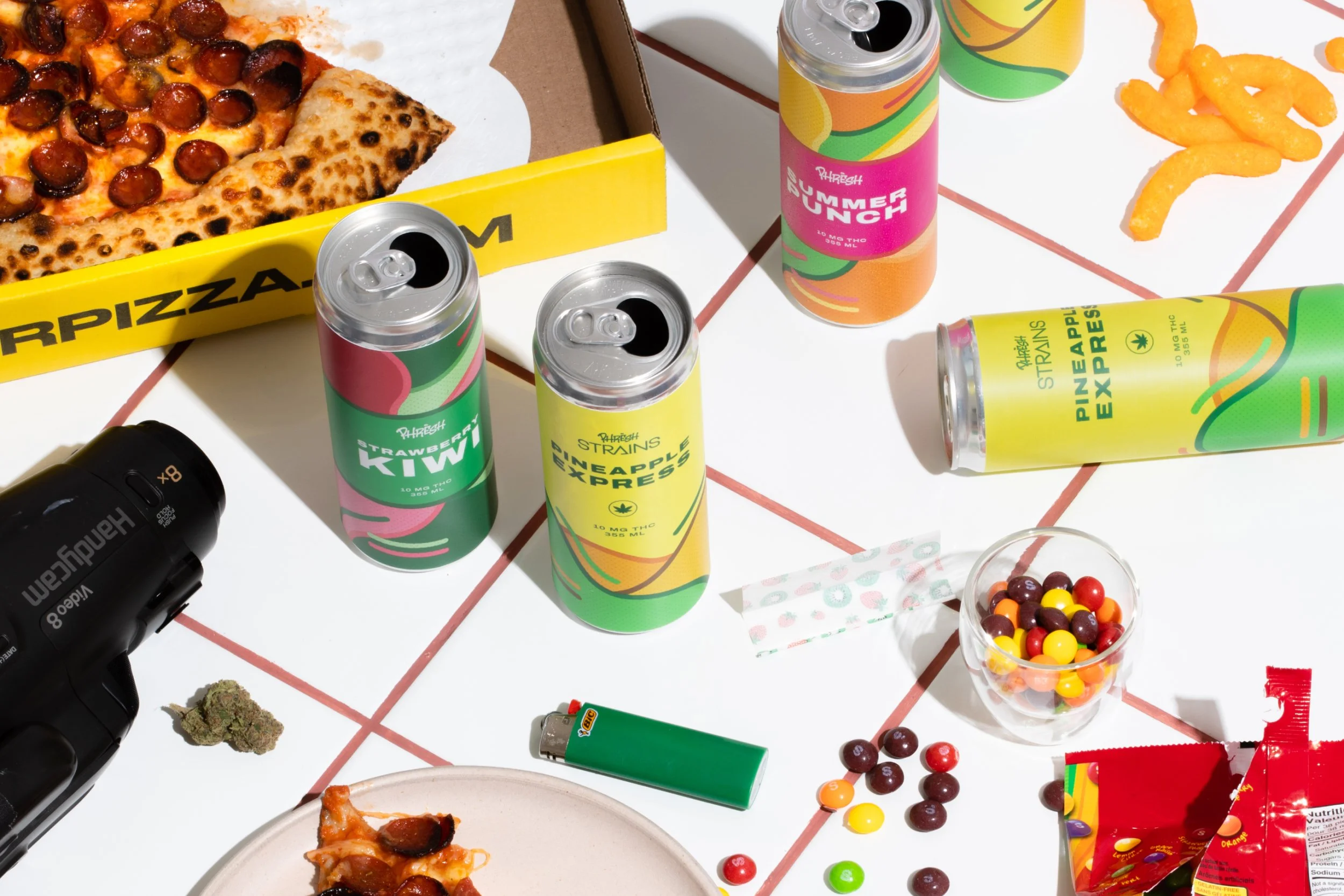
Phresh is a Canadian craft beverage brand specializing in cannabis-infused drinks for legacy consumers, known for bold and nostalgic flavour pairings. Their Strawberry Kiwi flavour quickly became a top-seller in Ontario’s cannabis market. As they prepared to grow their product lineup, the Phresh team brought us in to evolve their brand across packaging, social media, and in-store print assets—extending the Phresh ethos across every touchpoint.
Design Challenge
How might we attract both seasoned cannabis consumers and curious newcomers—while visually communicating Phresh’s bold, flavour-forward identity?
Our Solution
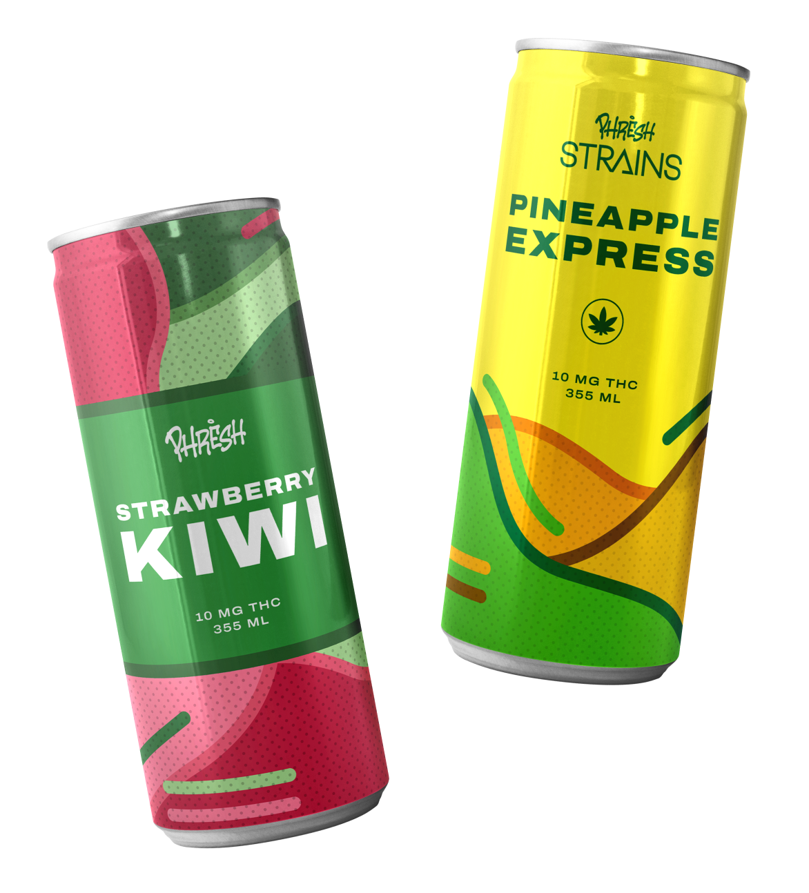
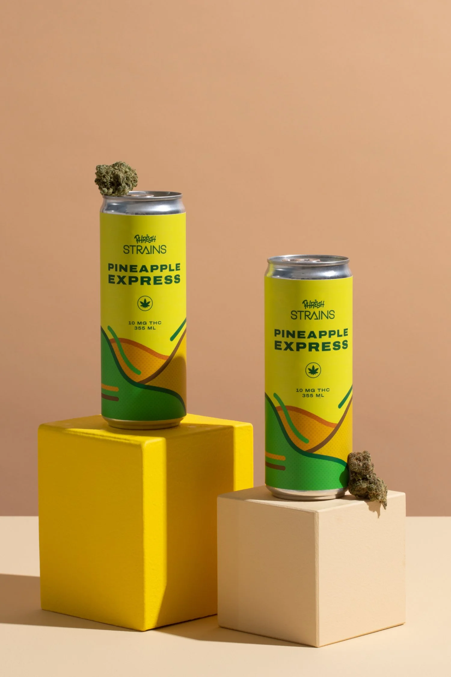
Inspired by the expressive energy of graffiti and its deep roots in stoner culture, we crafted a vibrant, eye-catching visual system. Bold typography, bright colour palettes, and playful patterns work together to generate buzz around each can. Tapping into Phresh’s core mantra, "Bold Flavours, Maximum Potency", each SKU is paired with a unique colour story that reflects its flavour notes.
As Phresh expanded its classic line, a new range—Phresh Strains—was introduced, designed to mimic the taste profiles of iconic cannabis flower strains. We developed distinct, yet connected packaging systems for both lines. Together, they form a cohesive, energetic brand presence that’s unmistakably Phresh.


Next Project →